It’s been a long time since My Opera decided to give all its users a few months notice to abandon ship. While some have already moved on, and believe me I have, most still have a longing for something similar.
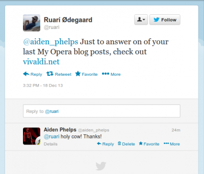
And here it is. Thanks to Ruarí Ødegaard for the tweet.


🙂
I think a good idea for the Vivaldi button would be to keep it as the show panel button with a round Vivaldi symbol or anything. Panels should not push the web pages instead of which it can be a transparent panel that comes up along with the options available in the Vivaldi button if possible. — feeling irritated